Using SVG sprites with React
React에서 SVG를 다룰 때 주로 SVGR로 아이콘 하나하나를 컴포넌트로 바꿔 썼습니다. 편하긴 한데, 아이콘이 늘어날수록 번들에 같은 형태의 컴포넌트가 계속 쌓이고 브라우저 캐싱이 제대로 걸리지 않을 때 리소스가 낭비됐습니다.
다른 방법을 찾다가 네이버가 쓰는 방식을 보게 됐습니다. 서비스 아이콘 전체가 한 장의 이미지에 들어 있습니다.
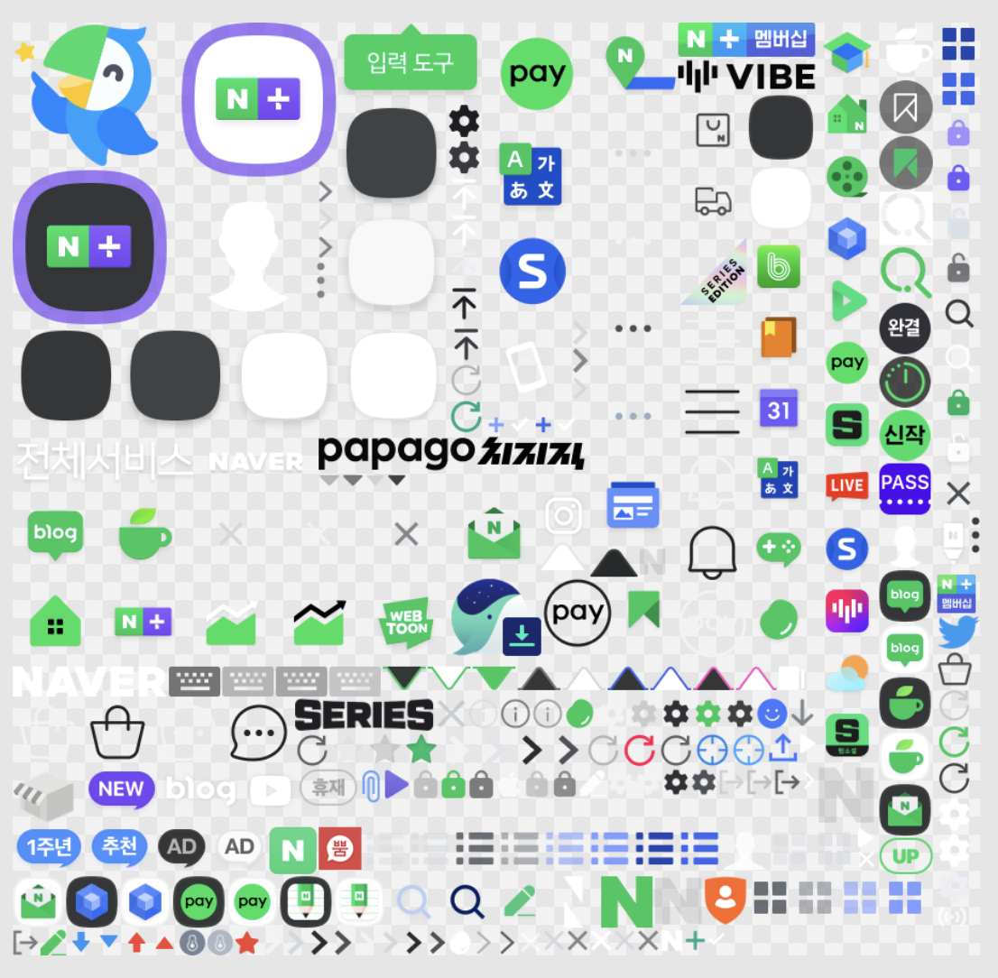
낱개로 요청하면 수십 번 왕복해야 할 것을 한 번에 받아옵니다. SVG에도 같은 개념이 있습니다.
<use>
<use>는 이미 정의된 SVG 요소를 다른 위치에서 참조해 재사용하는 요소입니다.
<svg viewBox="0 0 200 100" xmlns="http://www.w3.org/2000/svg">
  <!-- 재사용할 원 정의 -->
  <circle id="myCircle" cx="20" cy="20" r="10" fill="blue"/>

  <!-- use로 원 재사용 -->
  <use href="#myCircle" x="50" y="0"/>
  <use href="#myCircle" x="100" y="0"/>
</svg>
원을 한 번만 정의해 두고 href로 id를 가리키면 됩니다. 이걸 아이콘에 적용하면, 여러 아이콘을 하나의 SVG 파일에 모아두고 필요한 것만 골라 쓸 수 있습니다.
스프라이트 만들기
아이콘 하나하나를 준비할 때 두 가지만 지키면 됩니다. 파일명이 곧 id가 되므로 의미 있는 이름을 붙이고, 색을 바깥에서 지정할 수 있도록 fill을 currentColor로 둡니다.
<svg width="16" height="16" viewBox="0 0 16 16" fill="none" xmlns="http://www.w3.org/2000/svg">
  <path d="M8.49994 4.46572V1.75C8.49994 0.783502 7.71644 0 6.74994 0C5.78345 0 4.99994 0.783501 4.99994 1.75V7.0901L3.8009 7.32991C3.03795 7.4825 2.51833 8.19312 2.60425 8.96642L2.94926 12.0716C2.9934 12.4688 3.13214 12.8497 3.35385 13.1822L4.78705 15.3321C5.06525 15.7493 5.5336 16 6.03513 16H12.4196C12.9579 16 13.4549 15.7116 13.722 15.2442L15.1172 12.8025C15.3609 12.3761 15.5121 11.9031 15.561 11.4143L15.8325 8.69901C15.9503 7.52164 15.0257 6.5 13.8425 6.5H13.2609C13.2071 6.42702 13.1412 6.34155 13.0663 6.25214C12.8746 6.02336 12.5559 5.68385 12.1856 5.53576C11.8222 5.39037 11.3401 5.40403 11.0281 5.42828C10.9825 5.43183 10.9382 5.43584 10.8956 5.44012C10.7921 5.18252 10.6094 4.94975 10.3363 4.79793C10.1415 4.6896 9.87806 4.56572 9.598 4.50971C9.28882 4.44787 8.85901 4.45166 8.54747 4.46377C8.53146 4.46439 8.51561 4.46504 8.49994 4.46572Z" fill="currentColor"/>
</svg>
아이콘이 많아지면 손으로 합치기 어려우니 스크립트로 자동화합니다. 하는 일은 단순합니다. 폴더에서 SVG를 모두 읽고, 각 파일의 <svg> 태그를 <symbol>로 바꾸고, 파일명을 id로 달아 하나의 파일에 모읍니다. width, height, xmlns 같은 개별 속성은 스프라이트 안에서는 의미가 없으므로 제거합니다.
/**
 * Generate sprite svg.
 * @param files SVG files
 * @param inputDir Input directory path for results
 * @param outputPath Output directory path for results
 */
async function generateSprite({
  filePaths,
  inputDir,
  outputPath,
}: {
  filePaths: string[];
  inputDir: string;
  outputPath: string;
}) {
  const symbols = await Promise.all(
    filePaths.map(async (filePath) => {
      const input = await readFile(path.join(inputDir, filePath), "utf8").catch(
        () => ""
      );
      const root = parse(input);

      const svg = root.querySelector("svg");

      if (!svg) throw new Error("No SVG element found");

      svg.tagName = "symbol";
      svg.setAttribute("id", iconName(filePath));
      svg.removeAttribute("xmlns");
      svg.removeAttribute("xmlns:xlink");
      svg.removeAttribute("version");
      svg.removeAttribute("width");
      svg.removeAttribute("height");

      return svg.toString().trim();
    })
  );

  const output = [
    '<?xml version="1.0" encoding="UTF-8"?>',
    '<svg xmlns="http://www.w3.org/2000/svg" xmlns:xlink="http://www.w3.org/1999/xlink" width="0" height="0">',
    '<defs>',
    ...symbols,
    '</defs>',
    '</svg>',
    '',
  ].join('\n');

  return checkFileChanged(outputPath, output);
}
전체 스크립트는 react-svg-sprites에 있습니다.
Icon 컴포넌트
이제 감싸기만 하면 됩니다. <svg> 기본 속성을 그대로 받고, 거기에 아이콘 이름·색·크기를 더한 인터페이스입니다.
import type { VariantProps } from 'class-variance-authority';
import type {ComponentProps} from 'react';
import { iconStyles } from '@/components/icon/styles.ts';
import { type IconName } from '@/types/icon';
import {cn} from "@/utils/formatUtil.ts";

export type IconProps = VariantProps<typeof iconStyles> &
  ComponentProps<'svg'> & {
  name: IconName;
};

export default function Icon({ name, color, size, ...rest }: IconProps) {
  const { className, ...attributes } = rest;

  return (
    <svg
      className={cn(iconStyles({ size, color }), className)}
      {...attributes}
    >
      <use href={`/sprite.svg#${name}`} />
    </svg>
  );
}href를 슬래시로 시작하게 두는 편이 안전합니다. 상대 경로로 두면 현재 라우트를 기준으로 해석돼 중첩된 경로에서 아이콘이 사라집니다.
크기와 색은 cva로 정의했습니다. 아이콘 색이 currentColor이므로 텍스트 색만 바꾸면 아이콘 색이 따라옵니다.
import { cva } from "class-variance-authority";

export const iconStyles = cva(["transition-all", "stroke-[0px]"], {
  variants: {
    size: {
      L: ["w-[24px]", "h-[24px]"],
      M: ["w-[20px]", "h-[20px]"],
      S: ["w-[16px]", "h-[16px]"],
    },
    color: {
      black: "text-black",
      white: "text-white",
      gray: "text-gray-500",
      red: "text-red-500",
      green: "text-green-500",
      blue: "text-blue-500",
    },
  },
  defaultVariants: {
    size: "L",
    color: "black",
  },
});IconName을 스프라이트에서 생성한 id 목록으로 두면 존재하지 않는 아이콘 이름은 타입 단계에서 걸립니다. 크기와 색도 마찬가지라, 정해둔 값 밖으로 나가는 순간 컴파일이 막힙니다.
다음은
실제 프로젝트에 적용해 보니 아이콘을 한 파일로 관리하게 된 것만으로도 리소스 측면에서 이득이 있었습니다. 다음에는 네이버가 하는 것처럼 아이콘을 아예 한 장의 래스터 이미지로 합치고 CSS 좌표로 잘라 쓰는 방식도 시도해 보고 싶습니다.
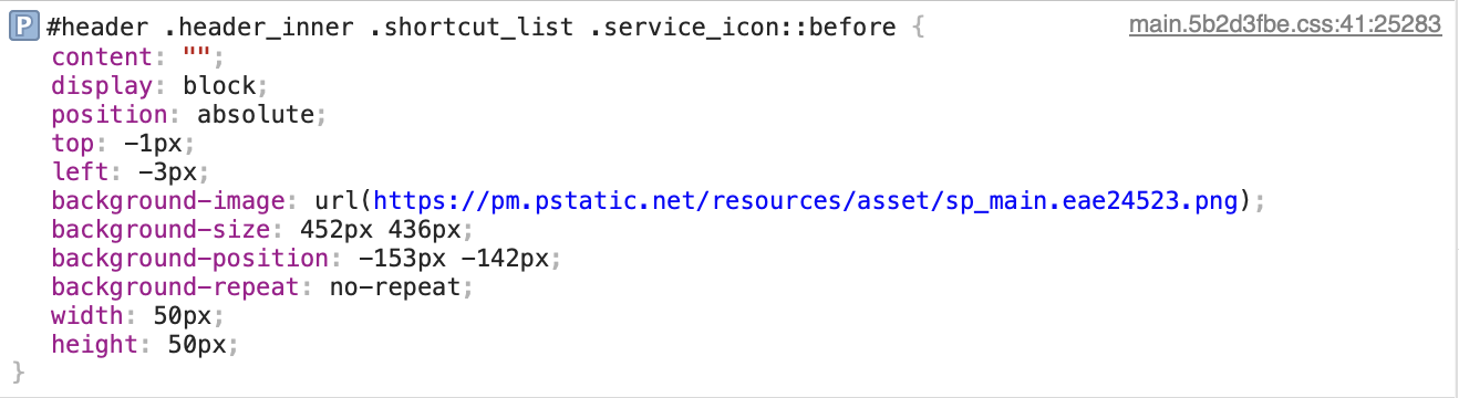
background-position으로 시트 안의 좌표를 지정해 아이콘 한 칸만 드러내는 방식입니다. 요청 수를 더 줄일 수 있지만, 좌표를 관리해야 하니 디자인 쪽과 규칙을 맞춰두는 게 먼저겠습니다.