Using SVG sprites with React
TL;DR
-
React 개발 시 SVG 파일들을 다룰 때 주로 SVGR 라이브러리를 활용해 컴포넌트로 만들어 사용했습니다. 하지만 브라우저 캐싱이 제대로 작동하지 않을 때 리소스가 불필요하게 소모되는 현상을 발견했습니다. 이 문제를 해결하기 위해 MDN 문서를 찾아보고 네이버의 구현 방식을 살펴보면서 좋은 아이디어를 얻을 수 있었습니다.
<use>
- SVG <use> 엘리먼트는 SVG 컨텐츠를 재사용할 수 있게 해주는 요소입니다. 이미 정의된 SVG 요소를 다른 위치에서 참조하여 재사용할 수 있게 해줍니다.
<svg viewBox="0 0 200 100" xmlns="http://www.w3.org/2000/svg">
  <!-- 재사용할 원 정의 -->
  <circle id="myCircle" cx="20" cy="20" r="10" fill="blue"/>

  <!-- use로 원 재사용 -->
  <use href="#myCircle" x="50" y="0"/>
  <use href="#myCircle" x="100" y="0"/>
</svg>
Sprites
-
SVG <use> 태그를 활용하면 여러 아이콘을 하나의 SVG 파일에 모아두고, 필요한 아이콘만 골라서 사용할 수 있습니다.
-
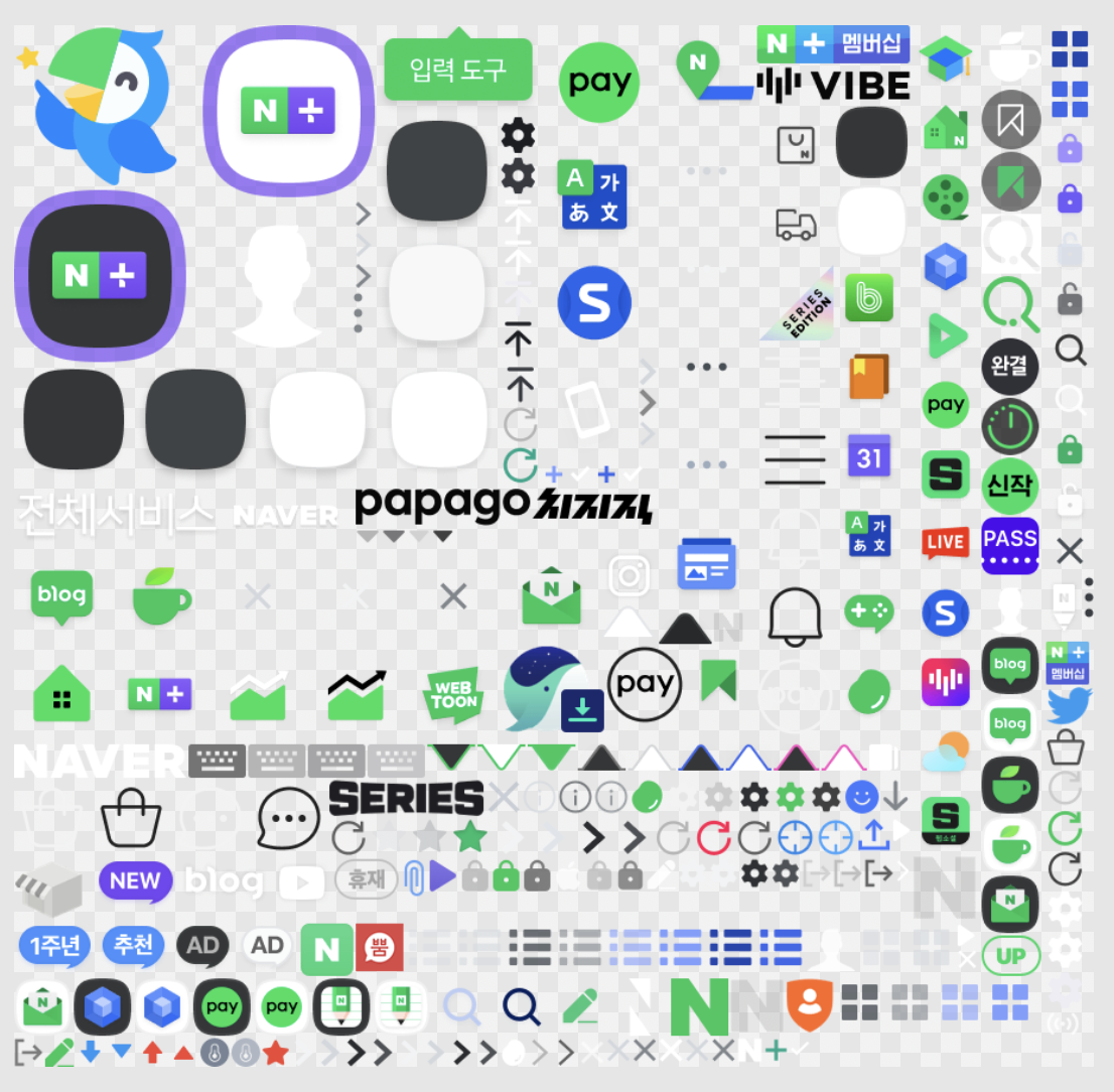
이 방식을 테스트해보기 위해 디자인 리소스 🔗에서 몇 가지 아이콘을 가져와 시험해보았습니다.
-
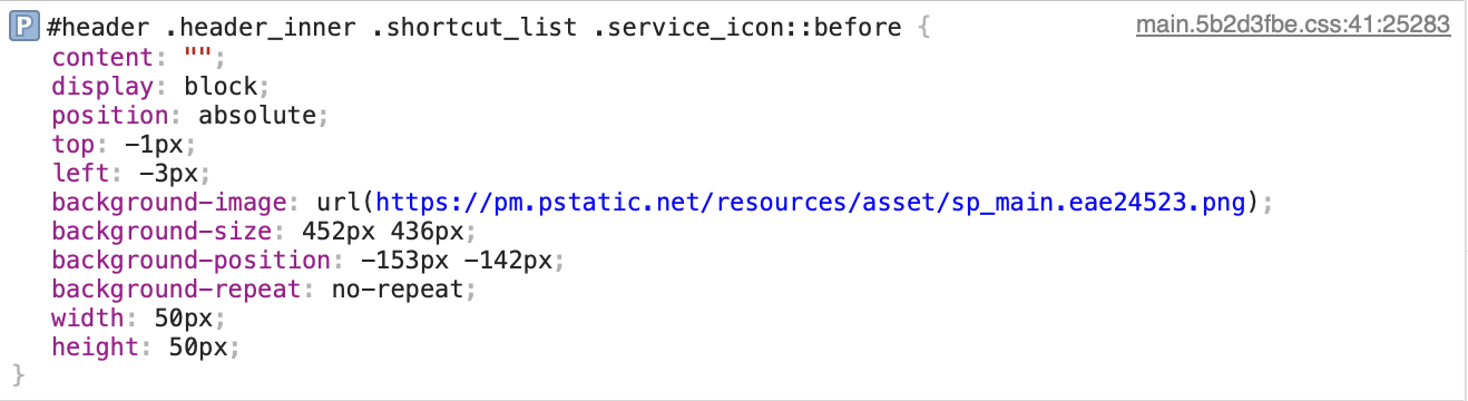
다만 아이콘이 많아지면 수작업으로 관리하기가 어려워집니다. 이를 해결하기 위해 개별 SVG 파일에서 필요한 정보를 추출하고 하나의 스프라이트 파일로 자동 병합하는 스크립트가 필요합니다. 스프라이트 SVG 안에서는 각 아이콘을 구분하기 위해 고유한 id가 필요하므로, 먼저 의미 있는 파일명을 지정해주어야 합니다. 또한 아이콘 색상을 외부에서 지정할 수 있도록 path 등 요소의 fill 속성값으로 currentColor를 설정합니다. 구체적인 예시는 아래와 같습니다.
<svg width="16" height="16" viewBox="0 0 16 16" fill="none" xmlns="http://www.w3.org/2000/svg"> <path d="M8.49994 4.46572V1.75C8.49994 0.783502 7.71644 0 6.74994 0C5.78345 0 4.99994 0.783501 4.99994 1.75V7.0901L3.8009 7.32991C3.03795 7.4825 2.51833 8.19312 2.60425 8.96642L2.94926 12.0716C2.9934 12.4688 3.13214 12.8497 3.35385 13.1822L4.78705 15.3321C5.06525 15.7493 5.5336 16 6.03513 16H12.4196C12.9579 16 13.4549 15.7116 13.722 15.2442L15.1172 12.8025C15.3609 12.3761 15.5121 11.9031 15.561 11.4143L15.8325 8.69901C15.9503 7.52164 15.0257 6.5 13.8425 6.5H13.2609C13.2071 6.42702 13.1412 6.34155 13.0663 6.25214C12.8746 6.02336 12.5559 5.68385 12.1856 5.53576C11.8222 5.39037 11.3401 5.40403 11.0281 5.42828C10.9825 5.43183 10.9382 5.43584 10.8956 5.44012C10.7921 5.18252 10.6094 4.94975 10.3363 4.79793C10.1415 4.6896 9.87806 4.56572 9.598 4.50971C9.28882 4.44787 8.85901 4.45166 8.54747 4.46377C8.53146 4.46439 8.51561 4.46504 8.49994 4.46572Z" fill="currentColor"/> </svg> -
SVG 스프라이트를 생성하는 전체 스크립트는 여기 🔗에서 확인하실 수 있습니다. 스크립트의 핵심 동작을 살펴보면, 먼저 지정된 폴더에서 모든 SVG 파일을 읽어옵니다. 그다음 각 SVG 파일에 대해 <symbol> 요소를 생성하는데, 이때 파일명을 id로 사용하고 원본 SVG의 내용을 자식 요소로 포함시킵니다. 마지막으로 이렇게 만들어진 모든 <symbol> 요소들을 하나의 SVG 파일로 통합하면 스프라이트 생성이 완료됩니다.
/**
 * Generate sprite svg.
 * @param files SVG files
 * @param inputDir Input directory path for results
 * @param outputPath Output directory path for results
 */
async function generateSprite({
  filePaths,
  inputDir,
  outputPath,
}: {
  filePaths: string[];
  inputDir: string;
  outputPath: string;
}) {
  const symbols = await Promise.all(
    filePaths.map(async (filePath) => {
      const input = await readFile(path.join(inputDir, filePath), "utf8").catch(
        () => ""
      );
      const root = parse(input);

      const svg = root.querySelector("svg");

      if (!svg) throw new Error("No SVG element found");

      svg.tagName = "symbol";
      svg.setAttribute("id", iconName(filePath));
      svg.removeAttribute("xmlns");
      svg.removeAttribute("xmlns:xlink");
      svg.removeAttribute("version");
      svg.removeAttribute("width");
      svg.removeAttribute("height");

      return svg.toString().trim();
    })
  );

  const output = [
    '<?xml version="1.0" encoding="UTF-8"?>',
    '<svg xmlns="http://www.w3.org/2000/svg" xmlns:xlink="http://www.w3.org/1999/xlink" width="0" height="0">',
    '<defs>',
    ...symbols,
    '</defs>',
    '</svg>',
    '',
  ].join('
');

  return checkFileChanged(outputPath, output);
}
Icon 컴포넌트
-
tailwindcss와 cva를 사용해서 간단한 React 컴포넌트를 만들었습니다. 컴포넌트의 인터페이스로 SVG의 기본 속성을 포함하고 있으며 이외에는 아이콘의 이름과 컬러 그리고 사이즈를 인터페이스로 받습니다.
import type { VariantProps } from 'class-variance-authority'; import type {ComponentProps} from 'react'; import { iconStyles } from '@/components/icon/styles.ts'; import { type IconName } from '@/types/icon'; import {cn} from "@/utils/formatUtil.ts"; export type IconProps = VariantProps<typeof iconStyles> & ComponentProps<'svg'> & { name: IconName; }; export default function Icon({ name, color, size, ...rest }: IconProps) { const { className, ...attributes } = rest; return ( <svg className={cn(iconStyles({ size, color }), className)} {...attributes} > <use href={`sprite.svg#${name}`} /> </svg> ); } -
cva를 사용해서 type-safe한 UI 개발 및 유지보수가 가능하게 구현했습니다.
import { cva } from "class-variance-authority"; export const iconStyles = cva(["transition-all", "stroke-[0px]"], { variants: { size: { L: ["w-[24px]", "h-[24px]"], M: ["w-[20px]", "h-[20px]"], S: ["w-[16px]", "h-[16px]"], }, color: { black: "text-black", white: "text-white", gray: "text-gray-500", red: "text-red-500", green: "text-green-500", blue: "text-blue-500", }, }, defaultVariants: { size: "L", color: "black", }, }); -
아주 간단하지만 적당한 인터페이스 정책과 type-safe하면서 스타일 유지보수에도 강점을 가지고있는 Icon 컴포넌트가 만들어졌습니다.
Conclusion
-
이 컴포넌트를 실제 프로젝트에 적용해본 결과, 여러 아이콘을 하나의 SVG 파일로 관리할 수 있어 리소스 효율성이 크게 향상되었습니다. 앞으로는 TL;DR에서 보여드린 이미지처럼, 디자인파트과 협력하여 모든 아이콘을 하나의 이미지로 통합하고 CSS 좌표 방식으로 개별 아이콘을 불러오는 방식도 시도해보고 싶습니다.